

I think that not only I, but other users Chrome for Windows, a number of sites to notice problems displaying custom fonts c. Read the text on these sites can be, but my eyes hurt. I would have it all and continued to suffer, but in a recent issue of its own projects just got an edge. I decided to look into all the details.
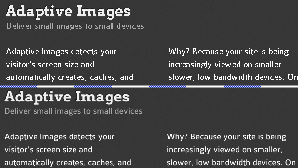
The difference in these two passages is evident. The first is made with a randomly selected site Adaptive-Images , and the second with its local copy, css which was changed just one line.
(Read the first version of the article can go directly to the UPD , which shows the working alternative solution for Chrome)
A small general observation - research presented in the paper were conducted under Windows 7. It will be interesting to see the comments on the situation on other platforms.
Thus, the difference between the above snippet is that the second of them when displaying the font does apply the so-called smoothing (antialiasing). How can force the browser to use this smoothing? As turned out later, it's very much depends on the browser and the operating system settings. I'll tell you that the smoothing is of two kinds, and their results are different. The first type I mentioned, and the second - the so-called sub-pixel renderig . But let's start from the beginning.
Search for solutions, as usual, began with the publication of this issue at one of the specialized resources. The answers were encouraging, but none of them helped to the full, even though they expanded the horizons of my knowledge in this area. Search solution work took three hours, during which the wall was damaged and therefore own forehead, although articles with turnkey solutions deficit was not. As usual, horny hiding somewhere in the punctuation.
Fortunately, I'm not the first who has this problem and keyword search quickly led to its solution through the use of SVG fonts in TrueType Unlike its counterpart, the Chrome rendered using the first type of smoothing, that is, anti-aliasing. It would seem - that is happiness - but there it was!
Certainly, there are other ways to obtain the necessary font-files, but for some reason I was chosen service FontSquirrel . I do not want to jump to conclusions, but in my opinion, their generator css contained errors.
In a guinea pig grab the font Colaborate from their website. The archive is a set of fonts in different formats, file and css demo.html Open final in Chrome and begin to wonder, where is, in fact, anti-aliasing? Especially strongly pronounced in his absence Bold typeface.
Open the css and see what we have generated for the server FontSqurell:
At first glance, no crime is not noticeable. I will not describe the process of finding solutions, interrupted thereby knocking their heads against the wall, here is a fragment immediately issued the desired result:
As described above, the only difference is in one line. Svg font definition delivered directly under the definition of eot and from the removed substring # ColaborateThinRegular. On the difference judge for yourself - right piece with the original css (no smoothing), left after the correction:
The explanation is very simple - move svg font description, we have increased the priority in WebKit browsers (Chrome, Safari), and it was used instead of TTF, which these browsers under Windows for some reason are not smoothed.
I can not judge the reasons for which the generator of the service makes it a css, and not some other. Maybe it used to work well, but since then things could change in the WebKit. I think that they should write a bug report if the comments do not bring any more logical explanation.
But that's not all that I have learned about Web fonts. Further discussed the subtle adjustments in FontSquirreldlya sets with Cyrillic characters, smoothing the other browsers and optimize the speed of loading web fonts. I'll start with the last point.
As you know, any beauty demands victims. In the case of custom fonts have to sacrifice load time by increasing the size of your data. You can combat this by applying our compression font files. Svg procedure to the next - with gzip compress your file, rename it - given the extension svgz and add a new server configuration MIME-type. Here is an example for Apache (you can specify in the. Htaccess):
And change the appropriate line in css (add z) - url ('ColabThi-webfont.svg z') format ('svg')
Please note, font / opentype is not a standard MIME-type, but it is this type of help to get rid of annoying bugs in the console Chrome: Resource interpreted as Font but transferred with MIME type image / svg + xml
Now about how to configure FontSquirrel for inclusion in the text characters beyond the ASCII-table 7. Displayed below in the screenshot mode settings are available in Expert. The variant, worked well in my case, do not forget to include other types of fonts, I needed only SVG.
I would appreciate clarification to these settings, if they can somehow improve, from experts in their field in the comments.
In conclusion, briefly touch features IE, FireFox and Opera. Let me remind you that this is a Windows7.
It is worth to say that the anti-aliasing algorithm used Chrome for SVG fonts, it is not the same as the sub-pixel anti-aliasing is used to display a variety of OS screen fonts. In Windows, this technology called ClearType . Look at the difference - red font is Chrome + SVG Antialiasing, black FireFox + TTF ClearType. In this passage shows clearly that anti-aliasing adds "extra" pixels, making the letters a little wider. For some models of krosbrauzernuyu pixel perfect layout can be forgotten.
Uncomplicated by experiment it was found that smoothing in FF and big O is directly dependent on the ClearType settings in the operating system. If you disable this feature, you have the browser to smooth fonts impossible, although IE ignores the instructions of the operating system and smooths fonts ever. As they say, some time ago there was a css directive (-webkit-) font-smooth (ing), but the latest versions of FireFox support it somehow removed . If you know how to get around these restrictions, please write about it in the comments. Similarly vague answer to the question how to disable font smoothing, because there are situations where this should not be.
In the process of writing this article was read by a number of feature articles and seen a lot of sites in the light of the non-standard fonts, in order to determine for themselves the scope of application of this useful technology. I want to say that I made the following conclusion - use custom fonts can and should be(otherwise, all zohavaet bootstrap), but in limited quantities, for the decoration of some elements of UI. And the main text content to be left alone! Otherwise, the site may not look the way it was originally intended. In support of these words give a link to a thoughtful article , which says about the same thing, but in greater detail.
Perhaps in the future this will change, but that the browsers must
create a management subsystem font rendering, showing the same text,
even within a single platform.
UPD Eureka! After a reminder of GreatRash decided all know the reason why I did not work-webkit-font-smoothing, and found in the bug report . There's over a hundred comments, but among real sluggish buhteniya met brilliant ! This design eliminates the SVG fonts and, at first glance, Chrome was to render the text in the same way as all the other browsers, although the distance between the letters is different, but it is, apparently, also can be treated
The difference in these two passages is evident. The first is made with a randomly selected site Adaptive-Images , and the second with its local copy, css which was changed just one line.
(Read the first version of the article can go directly to the UPD , which shows the working alternative solution for Chrome)
The Problem
A small general observation - research presented in the paper were conducted under Windows 7. It will be interesting to see the comments on the situation on other platforms.
Thus, the difference between the above snippet is that the second of them when displaying the font does apply the so-called smoothing (antialiasing). How can force the browser to use this smoothing? As turned out later, it's very much depends on the browser and the operating system settings. I'll tell you that the smoothing is of two kinds, and their results are different. The first type I mentioned, and the second - the so-called sub-pixel renderig . But let's start from the beginning.
Search for solutions, as usual, began with the publication of this issue at one of the specialized resources. The answers were encouraging, but none of them helped to the full, even though they expanded the horizons of my knowledge in this area. Search solution work took three hours, during which the wall was damaged and therefore own forehead, although articles with turnkey solutions deficit was not. As usual, horny hiding somewhere in the punctuation.
Chrome
Fortunately, I'm not the first who has this problem and keyword search quickly led to its solution through the use of SVG fonts in TrueType Unlike its counterpart, the Chrome rendered using the first type of smoothing, that is, anti-aliasing. It would seem - that is happiness - but there it was!
Certainly, there are other ways to obtain the necessary font-files, but for some reason I was chosen service FontSquirrel . I do not want to jump to conclusions, but in my opinion, their generator css contained errors.
In a guinea pig grab the font Colaborate from their website. The archive is a set of fonts in different formats, file and css demo.html Open final in Chrome and begin to wonder, where is, in fact, anti-aliasing? Especially strongly pronounced in his absence Bold typeface.
Open the css and see what we have generated for the server FontSqurell:
@font-face { font-family: 'ColaborateThinRegular'; src: url('ColabThi-webfont.eot'); src: url('ColabThi-webfont.eot?#iefix') format('embedded-opentype'), url('ColabThi-webfont.woff') format('woff'), url('ColabThi-webfont.ttf') format('truetype'), url('ColabThi-webfont.svg#ColaborateThinRegular') format('svg'); font-weight: normal; font-style: normal; } At first glance, no crime is not noticeable. I will not describe the process of finding solutions, interrupted thereby knocking their heads against the wall, here is a fragment immediately issued the desired result:
@font-face { font-family: 'ColaborateThinRegular'; src: url('ColabThi-webfont.eot'); src: url('ColabThi-webfont.eot?#iefix') format('embedded-opentype'), url('ColabThi-webfont.svg') format('svg'), url('ColabThi-webfont.woff') format('woff'), url('ColabThi-webfont.ttf') format('truetype'); font-weight: normal; font-style: normal; }
As described above, the only difference is in one line. Svg font definition delivered directly under the definition of eot and from the removed substring # ColaborateThinRegular. On the difference judge for yourself - right piece with the original css (no smoothing), left after the correction:
Two fragments
The explanation is very simple - move svg font description, we have increased the priority in WebKit browsers (Chrome, Safari), and it was used instead of TTF, which these browsers under Windows for some reason are not smoothed.
I can not judge the reasons for which the generator of the service makes it a css, and not some other. Maybe it used to work well, but since then things could change in the WebKit. I think that they should write a bug report if the comments do not bring any more logical explanation.
But that's not all that I have learned about Web fonts. Further discussed the subtle adjustments in FontSquirreldlya sets with Cyrillic characters, smoothing the other browsers and optimize the speed of loading web fonts. I'll start with the last point.
Optimization of load
As you know, any beauty demands victims. In the case of custom fonts have to sacrifice load time by increasing the size of your data. You can combat this by applying our compression font files. Svg procedure to the next - with gzip compress your file, rename it - given the extension svgz and add a new server configuration MIME-type. Here is an example for Apache (you can specify in the. Htaccess):
AddType font/opentype .svg .svgz AddEncoding gzip .svgz
And change the appropriate line in css (add z) - url ('ColabThi-webfont.svg z') format ('svg')
Please note, font / opentype is not a standard MIME-type, but it is this type of help to get rid of annoying bugs in the console Chrome: Resource interpreted as Font but transferred with MIME type image / svg + xml
Settings FontSquirrel
Now about how to configure FontSquirrel for inclusion in the text characters beyond the ASCII-table 7. Displayed below in the screenshot mode settings are available in Expert. The variant, worked well in my case, do not forget to include other types of fonts, I needed only SVG.
Screenshot of the settings
I would appreciate clarification to these settings, if they can somehow improve, from experts in their field in the comments.
Other browsers
In conclusion, briefly touch features IE, FireFox and Opera. Let me remind you that this is a Windows7.
It is worth to say that the anti-aliasing algorithm used Chrome for SVG fonts, it is not the same as the sub-pixel anti-aliasing is used to display a variety of OS screen fonts. In Windows, this technology called ClearType . Look at the difference - red font is Chrome + SVG Antialiasing, black FireFox + TTF ClearType. In this passage shows clearly that anti-aliasing adds "extra" pixels, making the letters a little wider. For some models of krosbrauzernuyu pixel perfect layout can be forgotten.
Antialiasing vs Subpixel rendering
Uncomplicated by experiment it was found that smoothing in FF and big O is directly dependent on the ClearType settings in the operating system. If you disable this feature, you have the browser to smooth fonts impossible, although IE ignores the instructions of the operating system and smooths fonts ever. As they say, some time ago there was a css directive (-webkit-) font-smooth (ing), but the latest versions of FireFox support it somehow removed . If you know how to get around these restrictions, please write about it in the comments. Similarly vague answer to the question how to disable font smoothing, because there are situations where this should not be.
Conclusion
In the process of writing this article was read by a number of feature articles and seen a lot of sites in the light of the non-standard fonts, in order to determine for themselves the scope of application of this useful technology. I want to say that I made the following conclusion - use custom fonts can and should be
UPD Eureka! After a reminder of GreatRash decided all know the reason why I did not work-webkit-font-smoothing, and found in the bug report . There's over a hundred comments, but among real sluggish buhteniya met brilliant ! This design eliminates the SVG fonts and, at first glance, Chrome was to render the text in the same way as all the other browsers, although the distance between the letters is different, but it is, apparently, also can be treated


0 commentaires:
Enregistrer un commentaire